Grocery stores are constantly being filled with new food brands, which places a greater importance on developing a strong brand. People identify and choose specific food products based on the brand, and a huge component of your visual brand is your logo. What are ways to create a strong logo that will make your customers hungrier?
Know the Why Behind Your Brand
Knowing the why behind your brand will help you create a logo that your customers will resonate with. What does your company value? What do your customers value? Thinking about who is picking up your product and how your product makes others feel will also help your logo stand out. Think about your product ingredients, flavor, and packaging and how these would differentiate your brand amongst others. As your logo is rooted in your brand, you’ll be able to communicate what makes your products special. A strong logo and brand will serve as the foundation on which your brand can grow.
Shapes for Food Logos
The shape of your logo doesn’t just affect the way it looks and should align with your brand identity. The shape of your logo can communicate a specific message to your target audience, especially when used along with fonts, colors, and imagery. Rectangle and square logos are associated with stability and reliability. Circle/oval logos are soft and round, which can have a more inviting feel.
![]()
Colors for Food Logos
Orange, yellow, and red are often used in food branding. Red stimulates hunger while yellow conveys feelings of friendliness and happiness.
Logos to Inspire Your Branding
Now that we’ve talked about different elements that you should consider when designing your logo, here are more logos to inspire your branding:
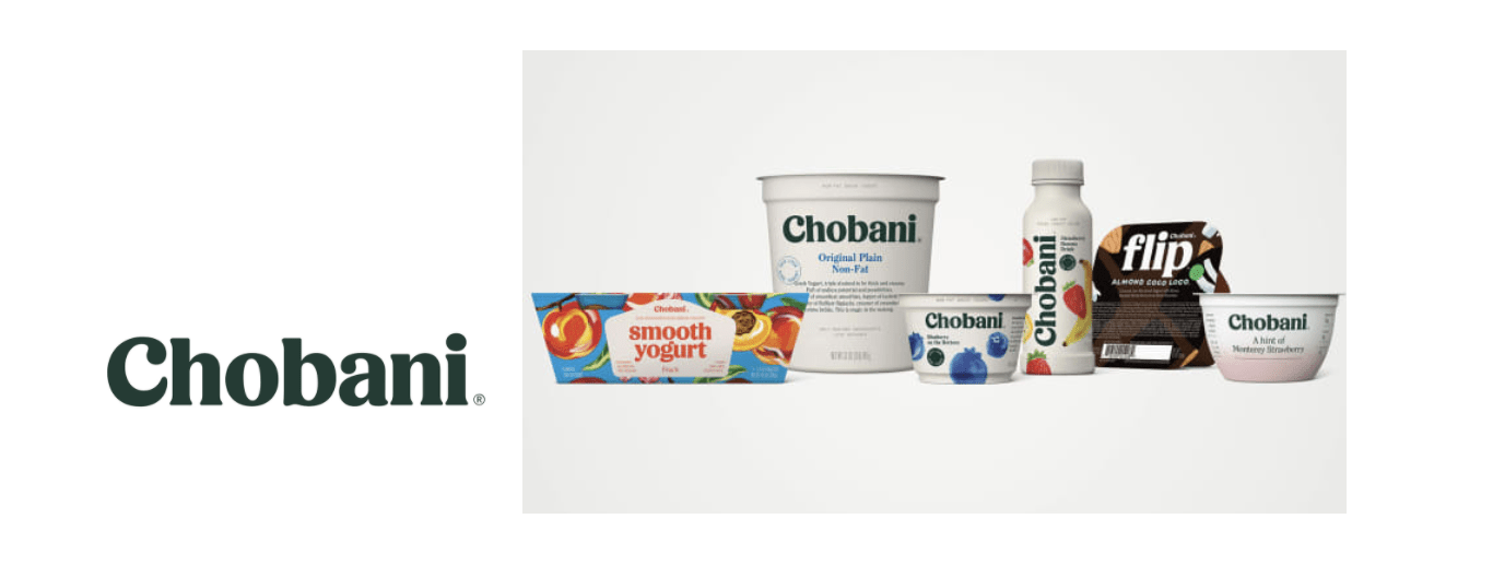
Chobani
Chobani is the number one Greek yogurt brand in the US. Chobani’s logo features fluid serifs, organic curves, and a forest green color. This aligns with the company’s mission to expand beyond yogurt and move towards becoming a wellness company.
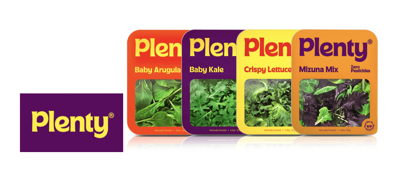
Plenty
Plenty is an indoor vertical farming company that uses its branding to make you hungry for greens. Plenty’s logo consists of curved strokes with leaf-like corners, and the bold typography is the most important component of their visual brand. Plenty paired bold typography with colors that stimulate hunger and make the brand feel friendly, such as red and yellow.
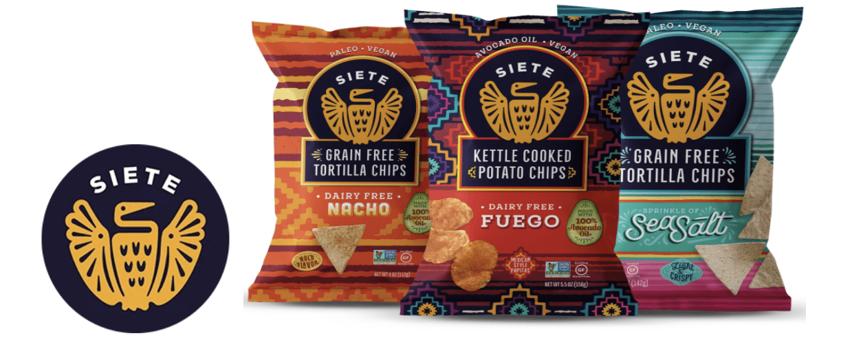
Siete Foods
Siete foods offers grain-free Mexican-American food. Its brand personality is welcoming, fun, passionate, health-conscious, and flavor-forward. The logo, which features a phoenix-like image and high-contrast colors, reflects “the beauty of the brand in all the tension it holds in being both Mexican and American, traditional and new.”
Now that you’ve got a great food product, it’s time for a great logo. If you’re ready to make your mark in the food industry, reach out to Deal Design today.