
The word “brand” is dictionary-defined as a type of product manufactured by a particular company under a particular name. However, this definition only scratches the surface of how a brand is defined in the world of design. “Brand” means something different to everyone, whether that person is a current consumer, potential customer, employee, prospect, or individual within a larger population. Brands can take various forms: a human, an idea, a place, an experience, or a tangible object. This makes the word “brand” difficult to define and describe… and that’s why each successful brand has a logo.
Logos serve as an iconic representation of a brand. A logo is a way for someone to quickly recognize and comprehend how a product or service relates to them. The logo design is the graphic expression of the brand, but building a brand is much deeper and more valuable.
Successful brands develop logos that have more than plain text of their name; they have a specific detail that indicates the brand’s overall intention, goal, or service provided. These details make the brand stand out among the competition. If you need a logo, it doesn’t matter if you are creating it yourself (in which case you could look here for some help) or if you are paying a professional to do it for you – your logo must make you stand out as an individual brand.
The following are 4 successful companies that have developed brands and logos that represent them:
- Amazon:
This iconic logo has a smiley face arrow underneath the brand name which depicts the brand’s intention: customer service and efficiency.
- FedEx:
FedEx creatively incorporates a secret arrow in between the E and the X in their logo which represents the brand as a delivery service.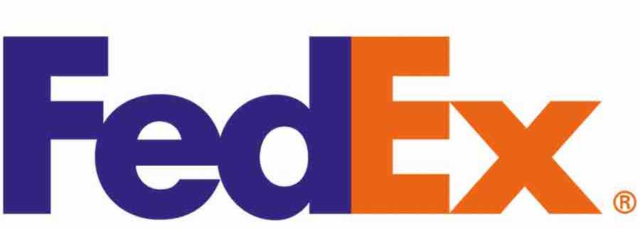
- Taco Bell:
The bell that is used in the Taco Bell logo represents the Hispanic culture related to Taco Bell’s fast food. The bell can also be associated with a ringing bell indicating that the food is ready!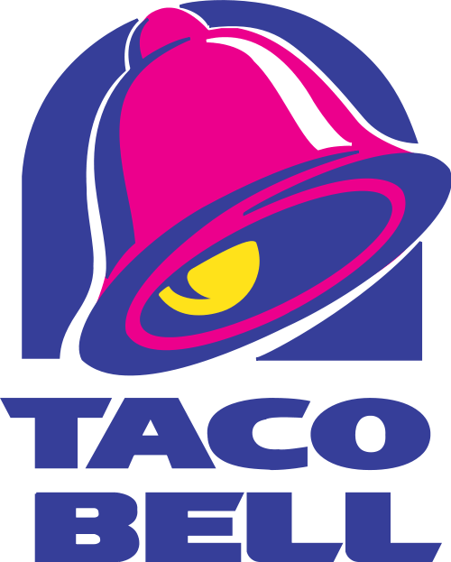
- Target:
The iconic target icon for the store Target indicates the shopper will hit a bullseye while shopping for what they are looking for.